It went up.
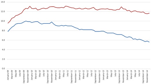
Unemployment in the United States actually rose in December 2014 from the previous month, from 11.56% to 11.66%. This is largely the result of a revision to November numbers declaring the unemployment rate during that month to be 11.56% instead of the previously released figure of 11.71%. The Reporting Gap, or the gap between the BLS’ official headline published figure and the actual figure that accounts for departures from the labor force, rose to a record high 6.06%. This is now 108% of the reported figure for unemployment, also a record high. The previous high for the Reporting Gap was set in September 2014, when the Gap stood at 6.04% over a reported figure of 5.9%.
Without the revision of November’s numbers, unemployment would actually have dropped by 0.05%. Of course, the reported figure plunged by a full 0.2% to 5.6%, the first time the figure has been that low since June 2008, when actual unemployment was a mere 6.87%. The last time unemployment was actually below 5.7% was in March 2007, when real unemployment was 5.54% and was reported to be at 4.4%.
Most importantly, the actual rate of unemployment, counting people who have left the labor force, remains 1.66 percentage points above the highest reported figure of the millennium.
While the American media has made much of a so-called “recovery” from the Great Recession that began in 2008, befuddlement continues to be reported on the nature of this recovery, how it is slow, protracted, and does not seem to be impacting those at the bottom of the economic ladder. Constant confusion has been expressed as to why it doesn’t “feel” like a recovery and why so many people seem to be unable to get work when the unemployment rate has purportedly plunged to almost economically desirable levels from a supposed peak at 10%. The Reporting Gap, which directly measures the number of hidden unemployed who have left the labor force, can be seen as a barometer of this otherwise inexplicable feeling. Not only have wages continued to stagnate, but the actual employment situation remains dire, despite much-vaunted reports that say otherwise.
Awareness of the issue of people leaving the labor force has been increasing over the past few months and years as people scramble to figure out why happy days appear to not be here again. Given that labor force participation hit a 36-year low in December 2014, it seems unbelievable that more people are not aware of the impacts of this loophole in how unemployment is reported by the BLS.
Real unemployment has been in double-digits since March 2009, marking almost six straight years where the actual number of unemployed has been larger than the reported peak of the unemployment crisis.
Here are your charts:

NB: The graphs above were edited on 10 January 2015 after I realized that I’d accidentally pulled October’s graphs instead. I normally don’t edit things on this page, but this seems to be a sufficiently trivial mistake and something a little misleading, so it warrants a quick change. The above graphs are now accurate, circa December 2014.
This is part of a continuing series on the under-reporting of unemployment in the United States of America.
Past posts (months indicate the month being analyzed – the post is in the month following):
November 2014
October 2014 – age assessment
October 2014
September 2014
August 2014
April 2014
December 2013 – seasonal assessment
December 2013
March 2013*
August 2012*
July 2012* – age assessment
July 2012*
*My initial analyses led to a slight over-reporting of the impact of the reporting gap, so the assessments in these posts are inflated, as explained and corrected in the December 2013 analysis.