Happy New Year, everyone. There haven’t been posts here for a long time, but that’s probably going to change again soon. Hopefully a lot of things will change soon.
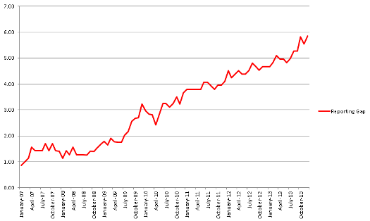
Regardless of which, a new milestone has been set: the all-time high gap between the reported unemployment figures and the actual unemployment figures in the United States of America was reached in December 2013, according to data gleaned from the BLS report out today. This gap is 5.85%, slightly eclipsing the previous record of 5.82% set in October 2013.
With unemployment reported as being 6.7% total, we are approaching the point where under-reporting of unemployment leaves out fully half of those actually unemployed. With the recent cessation of long-term benefits extensions by the federal government, we could see that point reached as early as the January 2014 report, due out in a month.
If you’re confused about this, it’s part of a series of reports I’ve done analyzing the crash in employment as hidden by the diminishing size of the labor force as a percentage of the overall US population. The previous reports are from August 2012, September 2012, and April 2013.
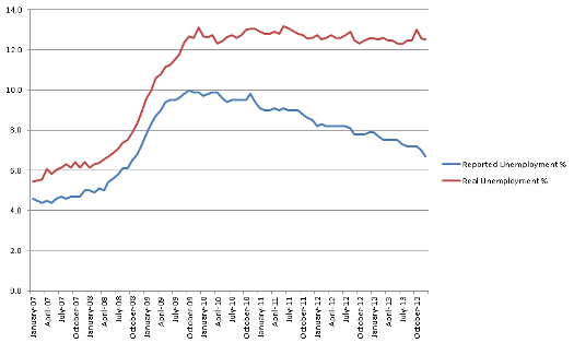
The numbers in the below graph will look a little different from those three previous reports. There are two reasons for that. One is that, in today’s report, the BLS adjusted seasonal adjustment for several months dating back to January 2009. All of their adjustments in 2013 reduced reported unemployment, but it did adjust up in a few past months as well. I have used the updated figures. The second, more important, reason is that I miscalculated somewhat in my previous reports. I used a compounding formula where I added the under-reporting percentage to those already counted in unemployment, which slightly increased my actual unemployment figures more than they should be. The average miscalculation was by 0.38% from January 2007 through April 2013, peaking at 0.74% in March 2013. I apologize for this miscalculation and assure you that the new formula is correct, as reflected in this graph:

The miscalculations led me to erroneously report that unemployment reached its Great Recession high at 13.8% in July 2011. This is inaccurate. The all-time Great Recession high for US unemployment is actually a mere 13.17%, reached in June 2011. While October 2013 nearly reached that high, at 13.02%, we’re way off that heady pace in December 2013, at only 12.55%. Unemployment had reached its Great Recession low in July 2013, at 12.28%, the lowest since unemployment was sky-rocketing in August 2009, when it was 11.76% and on its way up to 12.36% the next month.
Unemployment has been between 12.2% and 13.2% for the last four and a quarter years.
Does this make you feel like you’re crazy, when the media has reported a decline from 9.6% to 6.7% over that same period, with a brief high at 10% flat?
The craziness has been steadily increasing up till the December 2013 high, as reflected in this graph:

As observed in the prior posts, this meteoric rise in the difference between reality and the reported reality has corresponded very well with the meteoric rise in the stock market over the same period of time. Not that corporations really want to employ people, but that a lot of the euphoria over the alleged recovery which has strangely yet to actually manifest on Main Street is generated by this under-reporting.
Given that today’s report offered a crash in the officially reported unemployment rate even though fewer jobs were added than in any report for the last few years, the media explanations are finally bringing a tiny bit of attention to the reality of the unemployment rate’s inaccuracy as a metric for, well, the state of employment in our economy. In other words, it’s become impossible to hide the gap between reality and the fairy tale being told by how the official statistics are calculated. And surely that will only increase when the tsunami of long-term unemployed lose their benefits and are correspondingly omitted from the labor force.
Nonetheless, the scale of magnitude is breathtaking. For the BLS to represent that we had one month of double-digit unemployment when we’ve been suffering under more than four years of it is beyond the pale. And the picture of a steadily improving job market when we’ve had no such thing at all during that span is nearly as unforgivable.
The more you can spread this truth, the more you can help your friends who have been left out by the consistently failing American job market understand that it is BLS and the media that are crazy and wrong, not them.


