It’s been a while since I’ve been posting regularly, which is something that the extra time of summer will hopefully fix. And it’s been quite a while since I’ve revisited the issues of misrepresentation of the unemployment rate that have come from the disappearing labor market in the United States in the last few years. As a review, please check the original post from August of last year and the September follow-up.
Therein, I explain that by counting unemployment only as a percentage of the labor force and not the overall population, the unemployment rate leaves out millions of people who are functionally unemployed. Not underemployed or under-appreciated, but actually just straight-up not working when they could or should be. The labor force as a percentage of adult population has been crashing since the start of the financial crisis and it’s far outpacing the aging of the population.
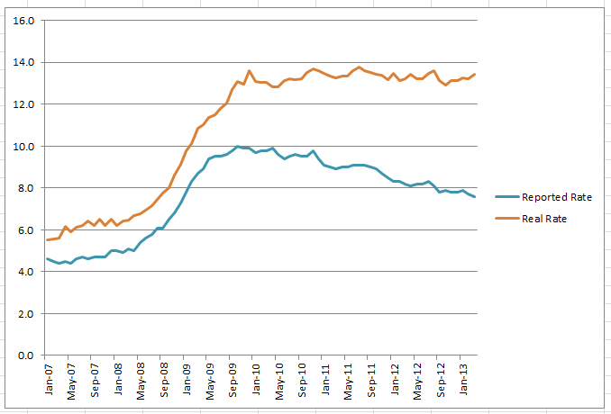
I hadn’t posted about the data since August. And while the reported rate of unemployment has dipped from 8.1% to 7.6% during that span, the actual rate when factoring in the labor force’s hidden unemployed has only declined from 13.6% to 13.4%. And while the reported rate has steadily declined, giving an image of slow but consistent improvement in the labor market, the reality is more distressing: after a brief dip in October to as low as 12.9%, unemployment is actually very close to its peaks since the crisis began, just 0.4% below the recession-era-high of 13.8% in July 2011. And it’s on its way up, steady or increasing since October of last year.

That graph is scary enough, with trend-lines clearly diverging and painting an opposite narrative of the economy. And this narrative dictates almost everything (well, everything that isn’t overtly rigged) about how our economy functions and the decisions people make. Though it doesn’t reflect the reality for people on the ground, how hard it actually is or isn’t to get jobs. But when people are having just as hard a time to get jobs as they have for the last three years, but they’re being told that it’s getting easier, this is highly corrosive to their morale, hope, and ultimately way of life. They personalize and internalize something that’s actually a broader struggle. And more damningly, we make policy based on the assumption that these flawed narratives we are telling ourselves are true, that we’ve done enough to help the little guy because while seven-and-a-half percent unemployment is still a bit uncomfortable, it’s basically livable and showing signs of improving. When really, we’re still at the height of the crisis.
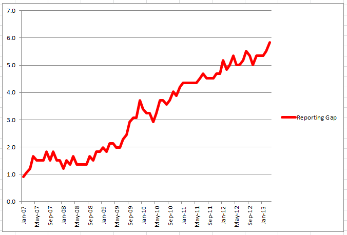
So here’s the money chart, the one that really tells the tale of this deception and how inflationary its impact is. This is the one that shows the gap, over time, between real and reported unemployment:

You could call this chart a lot of things. The Deception Chart. The Manipulation Chart, if you want to put a more sinister spin on why we use such an outdated version of unemployment and fail to track all the people who fall out of the ability to seek work or, more often, never have a real job in the first place from which to become “unemployed.” The I Think I’m Going Crazy Chart, to reflect the above phenomenon in starker terms, as people are unable to find work when the media is telling them that everyone else is finding it easier. And this chart, with a couple of bumps, is steadily upward. And hit a record high in March 2013 at 5.8%. At the same time the Dow Jones and other stock markets in the US started hitting their record highs as well, signalling the supposed end of the financial crisis.
5.8% may not sound like a big gap to you. It’s more than most economists think is a healthy total rate of unemployment for a society, so that should tell you something right there, but it still sounds like a manageable number. But when you consider that it’s a 76% increase in the unemployment rate from what’s currently being reported, that should probably put it in perspective for the skeptics out there. Unemployment is a 76% larger problem than people think, than the media reports, than the US imagines. We are approaching an easily foreseeable moment, if the general trends in each direction continue, when the actual rate of unemployment is double what the US perceives it to be. All because of how we choose a denominator in the most revered vital sign of economic growth for the little guy.
The most revered vital sign for the big guy is the stock market, and it’s hard to imagine that the big players therein aren’t aware of the data in this post. Of course for them, labor is not necessarily a sign of health or growth. Getting more done with fewer workers is the goal. And the efficiency achieved in this goal is a lot of why the market has been up when most people aren’t feeling any more well off. The problem is that when the market has so ruthlessly edited out jobs and labor, there’s simply not much reason they would bring them back. You have to be feeling pretty fat and happy to hire people that you don’t think will add value to your company. And by adding people who are going to work less efficiently, with their back less against the wall, then you risk the whole system. Ruthlessly keeping the jobs at a minimum is beneficial to all the big corporations at once.
The other big culprit in this phenomenon is the ongoing consolidation of wealth and corporations. The fewer companies, the more “efficient” (read: less labor) they can each be. The more that Wal-Mart and Starbucks grow, the more they can keep higher-wage lower-efficiency jobs from smaller firms out of the market. And this is before they even start colluding on what they’re going to pay or how thinly they’re going to stretch their workforce to ensure maximum efficiency across the board.
The theoretical back-end of all this is that eventually people will have so little money from not working that they will be unable to spend it at Wal-Mart and Starbucks and then the whole scheme will crash. The problem is that the very rich have been able to spend enough money that they make the overall economy seem much healthier than it is because it is relying so heavily on catering to the few people who have expendable income. But not in a way that creates more jobs for the middle or lower class so much as making those classes fight for a few jobs that largely cater to serving the super-rich. Of course, the US must somehow actually keep these people alive, through welfare or disability or unemployment benefits for those lucky enough to be counted, and at that point they also have the tiny bit of expendable income for a latte or a Wal-Mart gun.
The long-term implications of this general direction, though, look a lot like feudalism. Increasing power and influence and cash for those at the top, increasing revolving around the top for everyone in the middle and lower rungs, sufficient pressure on the working classes to make them put up and shut up with whatever they get in order to be among the few who actually have a job. Obviously we’re not to the crisis point of this general trend yet – eighty-six-and-a-half percent is still relatively high employment compared to some places in Europe or what things could be here in a bit. That still has most people working. But what happens if the real unemployment gets to 20% and they’re reporting 5%? Is that kind of internalized pressure sustainable? How wide can the gap between reality and surreality (or at least between the reality of the rich and the reality of most people) get before something breaks?
In the meantime, as we ponder that question, the trend-line of the reporting gap and the stock market continue to be roughly correlated. And the longer that correlation takes place, the less it feels like coincidence. That doesn’t make it causal, per se, but it does mean that both could be reflections of the very deep problem of the way our society is currently designed. Corporate capitalism isn’t a better system than others; we just haven’t seen how colossally this one fails yet. But it seems most of us will be lucky enough to see this one disproven in our lifetimes, if current trends continue.


