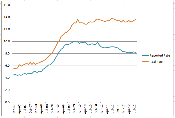
The actual unemployment rate ticked up in August, to 13.6%. It was at 13.5% in July. 13.6% is the highest rate since August 2011, which matched that figure, while July 2011 was 13.8%, the highest since the so-called “Great Recession” began in the United States of America.
Here is a graph of unemployment since January 2007, with reference to the reported BLS data on unemployment, which reported a 0.2% decline in unemployment, a stark contrast with the actual 0.1% increase:

The methodology for this was explained earlier on this blog and involves the reduction in the labor force from the BLS’ own data. As the labor force continues to plummet, the invisibility of the unemployed correspondingly skyrockets. Even the expanded measures of unemployment measurement such as “U-6” which claims to include “discouraged workers” fails to capture the actual depth of the unemployment question as it currently stands and most expanded measures have higher overall rates of unemployment, but are damningly reporting similar shapes of unemployment movement, most of which show great improvement in 2011 and 2012.
As is clearly visible from the above chart, however, this is not the case if one includes people who would have been considered part of the labor force in 2001 as part of the labor force now. And that doesn’t include all the people who have aged out of the labor force in the ensuing decade, but does include the graduating high schoolers and college students replacing them, who are (of course) notoriously unemployed. Most of these individuals never have held a job and thus have never been considered part of the labor force, thus explaining the massive decline in the size of what is considered the labor force as a percentage of the American populous aged 16+.
In early 2001, 67% of the population was considered part of the labor force, a reasonable benchmark for a country where capitalism is briefly and illusorily “working”. In August 2012, that figure hit a Great Recession record-low of 63.5%. Because a smaller labor force not only leaves out many unemployed people, but it also shrinks the number of people who need to be employed within it to make the economy look healthier than it is, the gap between reality and the reported reality is growing at an alarming rate.
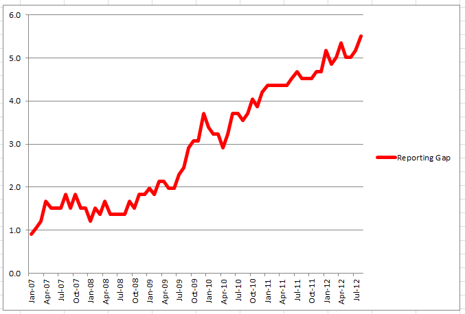
This chart shows the size of this gap between what the BLS reports officially and what its own data, when considering departures from the labor force, illustrates:

Scary, no? In 2008 and 2009, the BLS was basically reporting the terrifying free-fall picture of the economy as it tumbled in its haste to eliminate jobs to restore some semblance of profitability. But in late 2009, tons of the people who had been out of work for a while left the labor force, never to return, making unemployment look like it had plateaued and generating talk of a recovery. Reported unemployment peaked at an even 10% in October 2009, but quickly started falling thereafter, never to reach the dizzying heights of double-digits again.
Arguably, in early 2010, there was a tiny little recovery according to both of the above charts. From December 2009 to April 2010, real unemployment declined from 13.6% (where it stands today) to 12.8%. The reported rate hovered around 9.9%, mostly because people were re-entering the labor force as some actual jobs were created and they tried to get them. By October, however, we were back up to 13.5%. But the media was reporting 9.5% and talking of green shoots. By March 2011, the reported rate was below 9% for the first time, but actual unemployment was 13.3%, essentially flat with the record highs of the period. The stock market continued to rally on word of the recovery, one that all reporters who went out and talked to real people were surprisingly unable to find.
In fact, let’s plot the gap of the reporting on unemployment against the stock market figures since it bottomed out in March 2009:

And I think that’s officially the most terrifying thing I’ve ever put on a graph. No, it’s not perfectly correlated. But the Dow Jones takes into account a couple more things than unemployment. Interestingly, that early 2010 period when unemployment was actually better than it was being reported (at least on a directional level) was where there was the least correlation. At the same time, arguably the entire recovery and perception that the economy is improving, that US equities are worth something again, that everything’s going to be okay in the medium-term and (of course!) the long-term, all of the history of the US economy since March 2009, is based on a lie. Or at the very least, a subtle oversight.
Keep in mind that this gap has nothing to do with the “under-employed,” itself a meaningful data point of people working a few hours instead of full-time. Not one person in this gap is under-employed. They all have no work, or at least no legal work. Not one hour.
The gap is currently at a record-high 5.5%. For context, that was the entire (reported) national unemployment rate in May 2008. Or the entire (real) national unemployment rate in January 2007, when the reported rate was 4.6%, the last time the gap was below 1%. We are currently under-counting the unemployment rate by the entire unemployed population of January 2007.
Numerically, everyone who was out of work in January 2007 is currently so far out of work that they cannot even be counted by the BLS. They aren’t trying to work, they may never work. And meanwhile, the entire American public’s perception of the economy is what is slipping through that gap.
I have been saying for a long time that we’re moving toward a post-work economy, one where the model of making a wage for employment is archaic and only viable for the few. It looks now much more like we’re hurtling toward that reality. With blinders on so we don’t see the cliff until we’re midair.


