Nothing changed in November. At least as far as the jobs numbers go.
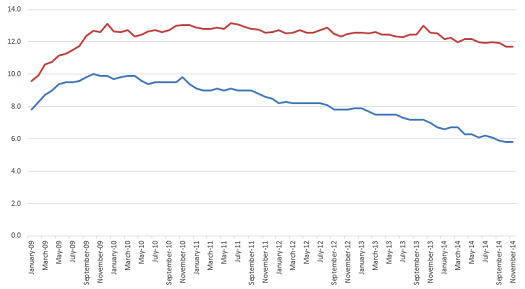
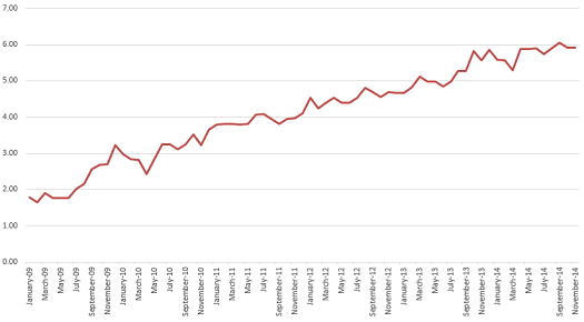
The BLS announced in today’s report that unemployment and labor force participation were unchanged at 5.8% and 62.8%, respectively. This means we have precisely mirrored last month’s 11.71% actual unemployment with a Reporting Gap also matching last month, at 5.91%. It’s the third straight month the Reporting Gap exceeded reported unemployment figures, representing that more than double the number of people the BLS claims are unemployed are actually unemployed.
The Reporting Gap is plenty disturbing, but nothing much else is new or interesting or distressing about this jobs report. Save one thing. The headline that the BLS wants you to remember about this month’s report is that “nonfarm payroll employment increased by 321,000”. The economy added 321,000 new jobs! This must be good news, right?
But if we added 321,000 new jobs and nothing changed, then what happened? How can we have such massive job growth and still have the exact same reported unemployment, labor force participation, and real unemployment?
Because 321,000 “new” jobs are just what it takes to maintain the status quo. This many added jobs is only keeping us at stagnant levels of job growth in terms of the percentage of the population actually employed. The much vaunted job growth, evidence of the recovery and incoming days of elation, simply represents stagnancy and maintenance of a situation where nearly 12% of America finds itself jobless.
Yet we find extremely misleading statements like this in the report:
In November, job growth was widespread, led by gains in professional and business services, retail trade, health care, and manufacturing.
The next eight (8!) paragraphs go on to detail the supposedly strong across-the-board growth, numerically, by industry.
Of course, this is like arguing that you have made a bunch of money because your gross receipts went up by 5% during a year in which inflation rose by 5%. There’s nothing actually there. The only changes are simply what is required to keep up with the growth and shift in population. It’s like saying “Yay, income tax revenues increased 10%!” in a year in which income levels also rose 10%. Except you actually get to keep that money if you’re the IRS. Whereas here, there’s nothing to actually show for all the allegedly huge job growth.
This is a really important lesson for processing job data in future. 321,000 sounds like a big number. It’s just the maintenance level, what’s necessary to keep up with the nation’s growth as a whole. Anything less than that is the situation actually getting worse for people. The BLS told it to you right there in the report. They just hope that you don’t think about the data for more than five seconds and then go uncork some champagne. Some champagne that you wouldn’t have bought otherwise, which might actually stimulate some fake economic growth they can crow about next year.
Here are your charts:
This is part of a continuing series on the under-reporting of unemployment in the United States of America.
Past posts (months indicate the month being analyzed – the post is in the month following):
October 2014 – age assessment
October 2014
September 2014
August 2014
April 2014
December 2013 – seasonal assessment
December 2013
March 2013*
August 2012*
July 2012* – age assessment
July 2012*
*My initial analyses led to a slight over-reporting of the impact of the reporting gap, so the assessments in these posts are inflated, as explained and corrected in the December 2013 analysis.