There are some more detailed posts in the work since I’ve decided I’m going to re-energize this blog and start posting again, but I think it’s time for a quick continuation of our series on the misreporting of unemployment. (The latest in the series was in December 2013.
Before everyone became obsessed with the latest US mass-shooter, there was this big groundswell of celebration that the unemployment problem has finally been fixed in America as reported unemployment crashed in April to 6.3%, from 6.7%.
And yet those just graduating from college and facing the new job market don’t seem to have it any easier. People still talk in hushed tones about how this “recovery” seems sluggish and iffy even though the numbers have normalized to nearly pre-2008 levels and the stock market has gone through the stratosphere.
So what gives? Is there anything to this story that unemployment is starting to recede so greatly?
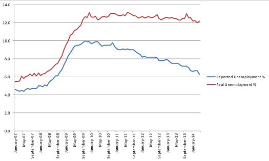
The good news is that unemployment in March 2014 was at its lowest level in four and a half years, since August 2009. That is no small thing. It seems there is some actual movement in the economy!
The bad news, of course, is that unemployment that month was still, uh, 11.99%. Or 1.99% higher than the highest reported rate of the whole “Great Recession”. That was in October 2009, when real unemployment was 12.69%.
Yeah, we just set a nearly five-year record low. At exactly 0.7% lower than the perceived height of unemployment during the Recession.
You can read past posts in this series to get an understanding of the rationale for the “Real Unemployment” figure, but it includes those who have left the workforce and are thus left out of American unemployment figures. People who have any sort of employment, even if it’s only a couple hours a week, are still included as employed. The only difference is that my Real Unemployment figure counts those who were in the labor force before the Great Recession as in the labor force now, based on a reasonable healthy-employment figure of percentage of the population in the labor force.
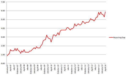
There’s more bad news, of course. As you can see on that chart, unemployment actually ticked up in April, to 12.17%, from that epically low 11.99%. Only a modest 0.18% rise, but that’s a big difference in the story from a 0.4% decline that was reported. And that 0.68% jump in the Reporting Gap led to an all-time high in that figure, of 5.87%.
As you can see, the reporting gap was actually declining all of 2014 before last month’s surge, with the reported figures closing in on the actual figures somewhat. Of course, this “closing in” is pretty relative, given that we are rapidly approaching the point where the under-reporting of unemployment eclipses the total figure for unemployment itself. Or, put another way, the point where more than half those unemployed in the US are not considered to be so by the official figures. With the reporting gap at 5.87% and reported unemployment at 6.3%, this very real tipping point seems reachable by year’s end.
I’ve discussed a lot how crazy this phenomenon makes people feel and how the surge in reporting gap mirrors that made in the stock market during the same period, so I won’t repeat myself more. Just wanted to give an update on where we stand and how insidious it is that people think April was a banner month for employment when it actually reflected regression.
Consider how differently people would be treating questions of employment, income inequality, and capitalism if they publicly discussed the fact that, from BLS’ own statistics and an understanding of what the labor force means, unemployment has been at 12% (if you’re willing to grant me 11.99% as 12%) or above since August 2009.


