It’s been a while since I’ve visited the question of our unemployment figures in the United States and what they imply for the real state of our economy and our future, such as it is. When I first started posting about this four years ago, no one was particularly telling the story of labor force participation rates as a proxy for unemployment and how these rates were hiding the real story behind the glorious recovery narrative that everyone was being fed in the wake of the Great Recession.
Last week, somewhat hearteningly, almost everyone described a jobs report where unemployment purportedly fell from 5.0% to 4.7% as a disaster because of the corresponding drop in labor force participation. The narrative has finally largely caught up with the reality, even if the official numbers still enable media pundits to talk about “full employment” like it’s a stone’s throw away instead of the miles it actually is from nearly 11%. I don’t have enough of a readership to take any credit for the shift in the narrative cognizance, unless it’s as part of a much broader grassroots movement quietly observing that the BLS has no clothes in a country where tons of people have decided it no longer makes sense to even try to work. But it’s still great that people are talking about this more widely.
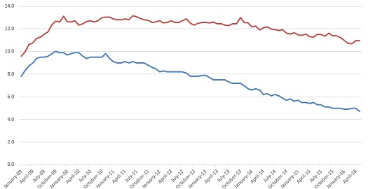
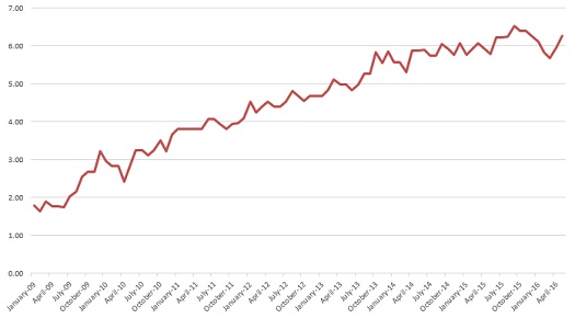
Part of why I haven’t posted in a bit is that unemployment numbers actually have been steadily falling in the last few months, at least through the March figures. The Reporting Gap, the distance between the reported percentage and the underlying reality when one accounts for labor force participation, was commensurately dropping, from a record-high of 6.52% in September to a two-year low of 5.67% in March. During this time, what I call Real Unemployment, accounting for those who’ve left the labor force, fell from 11.62% to 10.67%, nearly a full point. The reported figure in that span fluctuated between 4.9% and 5.1%, ultimately going from 5.1% to 5.0% from September to March.
This presents a damning flip-side to the problem I’ve been discussing here for four years. The media and the BLS were actually missing some real recovery and job strengthening that was happening during this six-month period. Granted that the larger headline might be unemployment remaining stuck above 10.5% for seven years and counting, but a 1% drop in six months was the second-best rally for employment during that whole span. Meanwhile, the media reported flatness and unchanged during this real improvement.
Of course, now we have the realization that 4.7% is not reflective of what actually happened in May. But it belies a more real story that the backtracking actually started in April. In April, unemployment popped back up to 10.96% from 10.67%. It was reported as steady at 5.0%. Then, in May, it was actually flat at 10.96%. This was the alleged disaster moment, when the 0.3% reported drop just showed fleeing the labor force. And that’s true, which is why the unemployment figure was actually flat. But the spike in unemployment actually happened the month before.
Here are your graphs:


Do any of these little fluctuations matter that much? Other than the distance between the notion of nearly full employment and more than seven sustained years over 10.5% unemployment? I would argue they do, especially when trying to spot trends. Labor force participation had cratered to 62.4% in September, but built all the way back up to 63.0% by March (a two-year high). Now it’s already back down to 62.6%, dropping by 0.2% each month. What does this portend for the economy? Are things already unraveling again, finally exposing the alleged recovery as hollow, shallow, and only benefiting those at the top? How will this impact the upcoming election?
Maybe having a one-month jump on the trends in these figures isn’t that big a deal. Maybe everyone talking about labor force participation in the same breath as unemployment means victory on this issue has already largely been achieved. But if we are headed for another official recession, it’s meaningful to realize that we’re starting from a place of 11% unemployment, not 5%, and that the hit to the economy that’s coming is on top of a problematic environment, not on top of a healthy one. At least if we’re looking at the bottom line for the bottom 50%, not the corporate titans.
This is part of a continuing series on the under-reporting of unemployment in the United States of America.
Past posts (months indicate the month being analyzed – the post is in the month following):
September 2015
July 2015
June 2015
March 2015
February 2015
December 2014 – labor force participation assessment
December 2014
November 2014
October 2014 – age assessment
October 2014
September 2014
August 2014
April 2014
December 2013 – seasonal assessment
December 2013
March 2013*
August 2012*
July 2012* – age assessment
July 2012*
*My initial analyses led to a slight over-reporting of the impact of the reporting gap, so the assessments in these posts are inflated, as explained and corrected in the December 2013 analysis.


