Usually these days, when the media reports “unemployment was flat, but job growth was sluggish,” you all know how to translate that by now. It means that unemployment actually ticked up through people leaving the labor force, but the BLS has ways of carefully ensuring that’s invisible to the public. It’s just like their repeated phrase in the monthly unemployment report that “labor force participation has been in a narrow range of 62.7% to 62.9%,” not realizing that the difference between a tenth of a percent in that number is worth 0.15% in the actual unemployment figure.
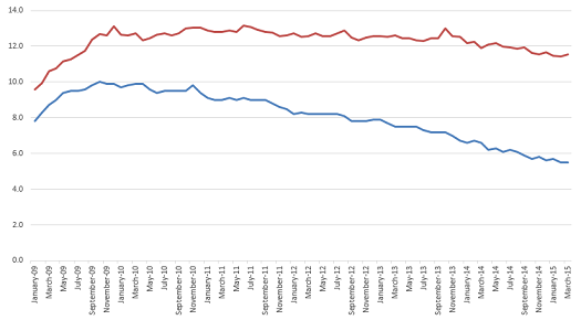
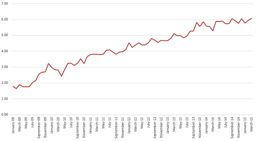
Actual unemployment ticked up in March, to 11.56%, the highest figure in three months. The Reporting Gap, measuring the distance between the published headline figure and the actual figure that accounts for labor force departure, jumped to 6.06%, matching its all-time high, also reached in December of last year. The Gap is now 110% of reported unemployment, also an all-time high.
Here are your graphs:


With labor force participation rates near a 40-year low, there is no real reason to believe unemployment will be under 11% anytime soon.
This is part of a continuing series on the under-reporting of unemployment in the United States of America.
Past posts (months indicate the month being analyzed – the post is in the month following):
February 2015
December 2014 – labor force participation assessment
December 2014
November 2014
October 2014 – age assessment
October 2014
September 2014
August 2014
April 2014
December 2013 – seasonal assessment
December 2013
March 2013*
August 2012*
July 2012* – age assessment
July 2012*
*My initial analyses led to a slight over-reporting of the impact of the reporting gap, so the assessments in these posts are inflated, as explained and corrected in the December 2013 analysis.


