With the first round of Democratic primary debates behind us and the next about to be announced, the 2020 campaign is in full swing. More than twenty candidates are elbowing for the right to take on Donald Trump as a major party contender. Meanwhile, nearly as many media outlets are trying to determine the best way to poll and track movement amongst these candidates over time, to try to gauge who has the best chance of winning the nomination. After 2016 was widely seen as a catastrophic failure of polling (538, all-time defender of polling, disagrees; your mileage may vary), there’s been an earthquake in subsequent polling methodologies. How should demographics be weighted? How much should those polled be believed? Is someone who didn’t vote last year really going to vote this year? These answers have never been uniformly answered by different American polling groups, but they’ve probably never been more divergent (and thus produced more disparate results) than right now.
The result is a 10-15 point spread in how, for example, Joe Biden is doing at any given moment, depending on which poll you ask. This dwarfs the purported 2-3 point margin of error so often touted by pollsters. And it makes for an extremely chaotic picture of the 2020 landscape, especially when each polling outfit has its own frequency and schedule matrix that isn’t always predictable. Polling aggregators, like RealClearPolitics and 538, haven’t caught up. RCP, especially, is considered the gold-standard in poll tracking, even by 538, who takes a more analytical report to its aggregation. But RCP’s fabled chart relies on the assumptions that (a) all topline polling is created equal and (b) all the methodologies are similar enough to just bung in together into one average. This last assumption is part of why RCP will only count polls taken in the last few days in its running average. Thus, Biden will look like he’s bounced back from his disastrous debate slightly when a more Biden-weighted poll comes out with new results, or Harris will look like she’s descending again when it’s just a poll where she’s consistently underperformed.
I argue with a cadre of mostly former APDA debaters on Facebook frequently about these polls and their implications, but particular arguments have crystallized with David Abbott, former UVA debater, current lawyer, and one-time primary candidate for the 89th district of the Georgia House. My mantra in arguing with Dave has been to remind him to only make claims about the polls that involve apples-to-apples comparisons, or change over time within a particular poll. He understands and agrees that the methodologies are widely disparate, but his inclination to believe the strength of Biden, for example, has inclined him to make apples-and-oranges comparisons when they suit his argument. To be fair, RCP does the same thing while trying to appear neutral.
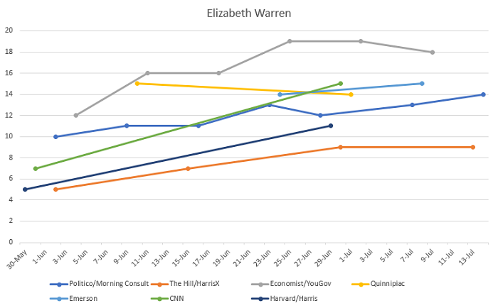
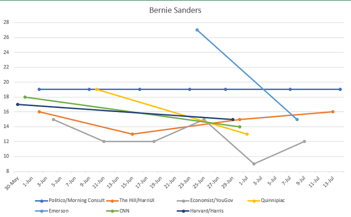
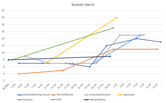
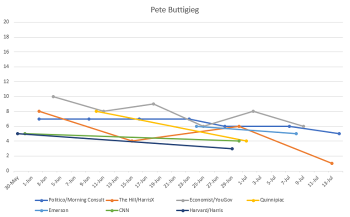
Thus, I’ve devised a visual way of representing the reality of the polling situation on the ground in 2020’s Democratic primary that doesn’t weight polls against each other but shows candidates’ performance in a holistic apples-to-apples way. Below are charts for the top five candidates: Joe Biden, Elizabeth Warren, Bernie Sanders, Kamala Harris, and Pete Buttigieg. The charts for each individual represent that candidates’ performance from the end of May until mid-July 2019, across various polls taken frequently, with each line representing a separate poll.
Some methodology notes before we dig in to some analysis:
(1) Dates for polls represent the last day in which the poll was conducted, not its release date, since that is more “real time” for when the poll captures potential voter opinion.
(2) Since what I’m trying to capture is change over time, each candidate’s chart is in a 20-point range. This means the change is precisely to scale with the other charts, but obviously the x-axis is widely variant. (For example, Joe Biden’s chart could be stacked on top of Pete Buttigieg’s because there is a wide gap between them in all polls so far.)
(3) I only used polling operations that released at least 2 (two) polls in the time period (polls last taking data from 5/30-7/14). Again, solitary dots are not really helpful for illustrating change over time.
(4) I chose this timeframe because I see it as the real start of the campaign, the buildup to the first debate and its aftermath. I would like to keep using this system as more data builds up and more debates make the race increasingly contentious.
Here are your charts:
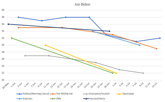
There’s a lot of cool conclusions to draw from this and part of the idea here is to put out the objective data in a new format and let you reach your own judgments. I am not trying to use this particular post, for example, to support my claim that Biden will earn zero delegates when the dust has settled in the 2020 primaries. But there are a few things that I think are worth pointing out before I let you run away with your own thoughts…
1. Exactly one poll (Politico/Morning Consult) shows any positive movement for Biden or negative for Harris after the June debates. In the most recent P/MC, Biden is up 1 point and Harris is down 1 point (within the margin of error, of course). It is the very most recent poll, so maybe there’s an argument this is an emergent trend, but it’s also the poll that’s by far the most bullish on Biden throughout (and close to the most bearish on Harris), so skepticism here is warranted.
2. While we’re on P/MC, do we think they’re even actually asking people about Bernie Sanders? That exact 19% across seven polls is so unbelievable. I mean, it fits a certain meme about Sanders’ consistent support across a specific swath of the electorate, but it almost feels like the way P/MC benchmarks their polls is to weight things to get Sanders to 19% and then everything else shakes out. It’s especially strange when contrasted with, say, Emerson’s cataclysmic change for Bernie pre- and post-debate, though that is clearly a huge outlier.
3. Harris won the first debate and Biden lost it. That is just inarguable from these results.
4. The Biden chart shows a really intriguing clustering of two separate poll formats: CNN, Economist/YouGov, and Quinnipiac seem to largely agree and widely diverge from Emerson, Harvard/Harris, and The Hill/Harris X. I don’t know quite what to do with that information, but it’s worth observing because you could almost drive a Kamala Harris-sized truck through that polling gap between these two groups.
5. Despite generally good reviews about his debating, Pete Buttigieg seems to be fading into obscurity.
6. Elizabeth Warren’s support is the slowest building, but her trendlines are the most sustainably positive. She was helped somewhat by the debate, but her momentum isn’t as reliant on the first debates as Harris’.
More to come!