This post is the second in a series that began here.
My friend Matt Frese requested an update on the primary poll analysis that compares apples to apples rather than RCP‘s penchant for bunging apples, oranges, and lemons into the bin together and basing their through-line on timing rather than polling methodology. He seemed to imply some skepticism on whether Joe Biden (D-decrepit) was really stagnating. I’d already been planning to run the numbers again and I think this will be something of a monthly feature going forward, so keep checking back!
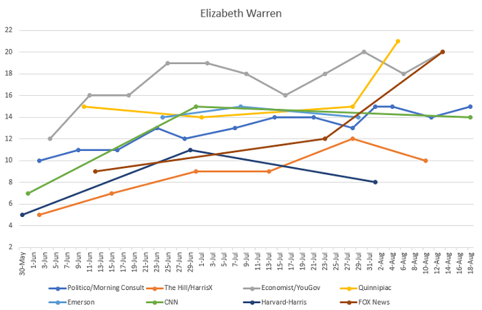
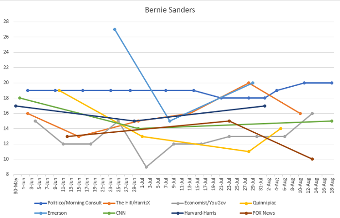
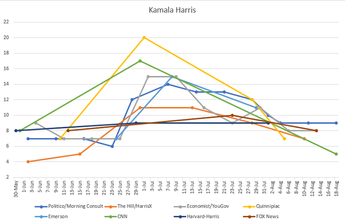
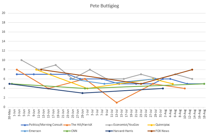
I’m going to show you the graphs for the top five candidates (Biden, Elizabeth Warren, Bernie Sanders, Kamala Harris, and Pete Buttigieg). In the wake of his handling of the El Paso shooting, it seemed like Beto O’Rourke might benefit from a bit of a bump to get him into this conversation. So far, he has both put up some of his best polls in weeks lately but also failed to top 5% anywhere, so it’s not really worth including him (his graph would look like an extra-flat version of Buttigieg’s). By September, he might merit another graph and, frankly, Harris might lose her spot if current deceleration is to be believed. Analysis after the graphs…
Some analytical notes:
1. Convergence of Methodologies on Biden
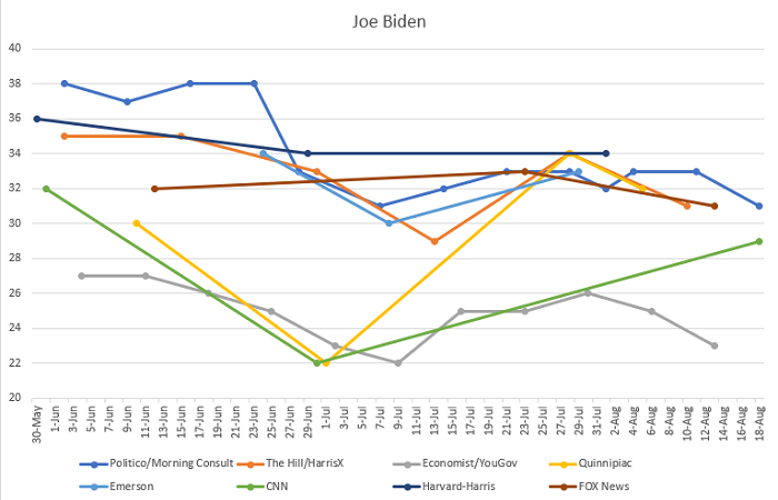
Biden has bounced in some polls that were bearish on him and lost ground in some polls that were bullish. It’s hard to say if polls have altered their methodologies to mirror each other, which definitely happens, or if there’s just more consensus on Biden generally. What does seem clear is that Biden has a ceiling (for now, at least) and that it’s below where he was before the debates. Without the distracting green CNN line, he would definitely look very sluggish overall and that CNN line is catching up to the second debate tiny bump that he got from beating expectation before slowly deteriorating again.
2. Kamala Harris Illustrates that Harvard-Harris is a Crap Poll
Harvard-Harris doesn’t poll often, but they don’t seem to be asking people when they do. No trend in all of the polling is more clear than Harris getting a huge bounce from the first debates and losing it all and possibly more from the second debates. Every poll reflects that except Harvard-Harris, which was just like “lolwut, she’s the same always.” Indeed, the not believing candidates change over time is a feature of Harvard-Harris, where nearly every candidate’s line is close to flat. They remain extra-bullish on Biden and extra-bearish on Warren, but I personally suspect this is because they’re using June data to generate more current polling numbers.
3. Warren Continues to be the Slow-n-Steady Tortoise in the Race
She’s behind Biden, but she continues to build steady momentum gains that show a clearer positive trend than any other candidate. If she has a ceiling, she hasn’t found it yet. Especially notable here is the FOX News poll, which was once quite bearish on her and now shows her surging. The polls that still don’t like Warren are Harvard-Harris (see above) and The Hill/HarrisX, which notably has all five candidates down in its last poll, a result that is really hard to square with reality unless they started allowing more uncertainty in their methodology. It’s also possible that they just found a lot more ambivalent people or that ambivalence is rising in the primaries, which is a reasonable conclusion from the generally ugly second debates.
4. Sanders is Extra-Noisy
The least conclusive graph of the set is Bernie’s, which is all over the map. Other than Politico/Morning Consult, which hilariously seems to benchmark their poll by Bernie being between 18-20% (disproportionately bullish), some polls think he’s tanking and others that he’s surging. And it doesn’t really align by whether they generally like or dislike Bernie. So this needs some time to shake out. You can make almost any case you want for where the Bern is being felt at present. Though it’s worth noting he’s recently come out ahead in two state-level polls, in NH and CO, so that could be a trend to watch. State-level polling obviously matters much more in a primary and a general election, as pollsters learned the hard way in 2016.
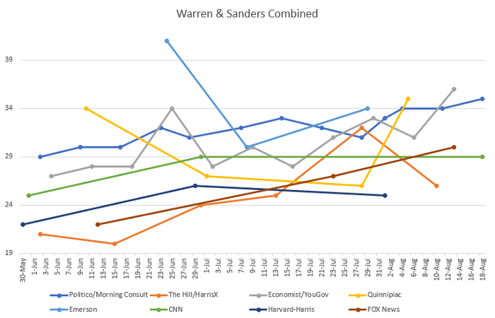
Finally, I will leave you with my new Warren + Sanders graph that I put on Facebook a while back. This is on the exact same X-axis as Biden’s graph, so it’s directly comparable. It also shows that (Warren + Sanders) as a group is ahead of Biden in all but two polls (the ones with Harris in their name), bucking the notion of Biden as a runaway front-runner just a bit and illustrating that the progressive lane is expanding, if in fact there are lanes at all in the primary, which is probably dubious.
