A couple days ago, I posted at length about jobs and where they’re going and the hidden unemployment rate. I promised to hop back onto the BLS website, a wealth of statistical information about our country, and look up the effects of the much discussed aging populous on the sapping of the labor force in America.
I expected that I might find something to mitigate the alarming findings of my last post, those that included that the unemployment rate is actually closer to 13.5% than 8.3% and that note, more importantly, that the unemployment rate is near its peaks of this recession with no signs of ebbing. I expected to find evidence that the aging population was responsible for a decent chunk of the people fleeing the labor force and thus not getting counted in the unemployment figures traditionally discussed by the media in this nation.
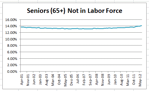
Instead, I found this:
What this graph shows is the percentage of seniors (aged 65 and above) who are not in the labor force as a percentage of the entire population that BLS counts in their labor survey (civilians age 16+ who are not institutionalized). Keep in mind that the percentage of those in the labor force has crashed by over 3% of the entire population during this recession (or at least since 2001), so if that’s mostly about aging, you’d expect a big uptick in this number. Or at least something visible.
There is a rise in late 2011 and 2012, but it’s almost imperceptible. The overall movement in this entire chart is about half a percentage point. And while we are at the highs of the non-labor-force seniors as a percentage of population for the last decade, this fact cannot be held responsible for the massive gulf between unemployment figures as reported and unemployment figures counting those who’ve left the labor force.
I could release an “age-adjusted” chart, but there are two problems with this. One, the difference in the line between the one I posted earlier this week and the one I’d post now is almost nothing. Two, we cannot assume that every senior in today’s world is out of the labor force by choice. Given that a higher percentage of seniors than ever before are working, many of those not working may be just as desiring of work as their younger counterparts.
Were the gulf even a full percentage point, let alone two or three percent, it would be worth it to adjust the rate for age. But in the absence of any major shift in seniors out of the labor force as a percentage of the overall population, I’m inclined to stand by my original chart and the rate of 13.5%. 13% is probably a slightly safer figure if you really want to wring your hands and mitigate. But that’s not enough of a shift to indicate any notable change in the trendlines for real unemployment.
And as a housekeeping note, this post is inaugurating my new “It’s the Stupid Economy” tag for the blog. I have a feeling I’m going to be tracking a lot of these things as I do more thinking about this in the coming months.


