Hit refresh on this page.
Go ahead, I’ll wait.
Yeah, that’s pretty different. Basically since the inception of this incarnation of my blogging, which was in October 2007 (seven years ago!), I’ve used some version of the WordPress theme Mushblue. Almost immediately after installing it, I started periodically tweaking the colors and changing the header images and pretty soon, the theme was more or less unrecognizable.
This was my first post. And in skimming over it to see how far I’ve come since then, this quote jumps out:
“Change is naturally something that seems scary to most. But change is also rivetingly exciting, and gives us the opportunity to do things differently than we did them last time.”
-2 October 2007
I’ve been kind of afraid to change the theme because I’m accustomed to the versatility I get from using that theme. But I wanted to make a change and take advantage of some of the newer, more dynamic themes that are available on WordPress and have been developed in the last seven years as the web converts to a bit more of a twenty-first century reality.
That said, honestly, when examining this, it looks like I’ve landed in a theme that’s not all that much of a change after all. The header goes all the way from end-to-end at the top and I really like the fonts and some of the stylistic choices and the fact that I can still customize the colors. But there are things I’m not in love with about this format. It does a book-style truncation of words that are too long but still doesn’t justify the text at the right side, which seems like a really frustrating compromise where everyone loses. And it posts both categories and tags at the top of each post, which I’ve been conflating for seven years as the same thing since my old theme only posted categories.
So maybe this one won’t last that long, though it will probably be here for October since I’ve just taken the time to customize it for October. Yay.
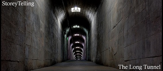
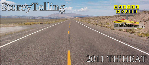
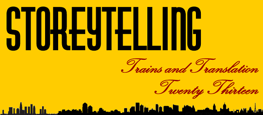
It seems like a good time to dredge up all the old theme images, though, if only for posterity, since I was working in the exact same format for the last seven years with the 800×350 pixel headers at the top:















Wow, that all takes me back. And now it’s time to try to move forward. If any of you out there who regularly read the blog are so inclined, I would really welcome some feedback about readability and the experience of visiting this website and what you would like to see changed as I try to perfect it. As much as I like it to be a testament to my emotional reality, it’s really a form of communication that is only as effective as its conveyance. I don’t do comments here because of the nature of Internet comments, but you can always e-mail me.
